Identity Manual — Version January 24, 2026

Brand Guidelines

"Finding Leaders, Building Teams,
Transforming Organizations."

This document defines the strategic, visual, and communication standards for Core Competent, ensuring clarity, consistency, and a premium identity across all brand touchpoints.

Foundations

About Core Competent

Our Essence

Core Competent is a boutique Executive Search and Organizational Development firm focused on building leadership, culture, and high-performance teams. We integrate strategic thinking, human intelligence, and proven methodologies to generate real and sustainable impact within organizations.

Mission

To drive organizational performance and sustainability by identifying key leaders, developing high-impact teams, and fostering conscious cultural transformation through strategic insight and rigorous methodology.

Vision

To be the leading boutique firm for Executive Search and Organizational Development in Mexico and Latin America, recognized for creating long-term relationships and building more human, competitive, and future-ready organizations.

Visual Identity

Logo System

Symbol Philosophy

The Brain Structure represents human potential in constant evolution. It is not a rigid outline but a living structure that expands through multiple connection points. It reflects the idea that talent, competencies, and leadership are not linear but the result of interaction, learning, and the convergence of diverse perspectives.

The Network of Nodes and Connections symbolizes competencies, relationships, and intersections between people. When these connections occur, they trigger collaboration, learning, creativity, and new perspectives. The symbol expresses how individual parts, when interacting, create a broader reality and more intelligent solutions.

Visual Style: Inspired by the intersection of human intelligence and systemic thinking. A contemporary, clean, and conscious aesthetic that communicates innovation, collaboration, and constant evolution. The design conveys intelligence, depth, and partnership.

Logo Variants

Application System

Core Competent Primary Logo
Primary Logo

The preferred version. Use this whenever space and legibility conditions allow.

Compact Logo
Compact Variant

Optimized for horizontal formats or applications with restricted height. Used for headers, presentations, and digital platforms.
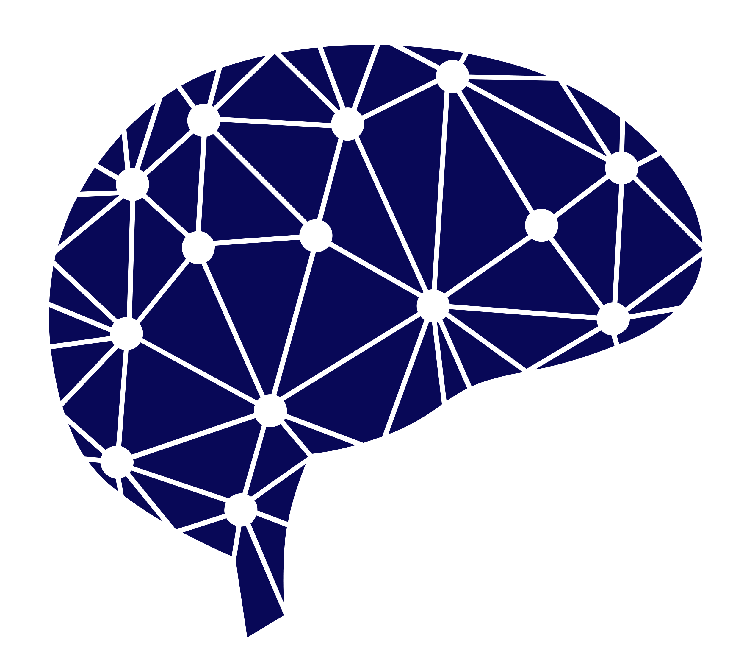
Isotype
Isotype

A network of nodes representing collective intelligence. Used for favicons, social media profiles, and standalone iconography.

Usage Guidelines

✓ Correct Usage
  • Always use official vector files
  • Respect original proportions
  • Maintain the required clear space
  • Apply over high-contrast backgrounds
✗ Avoid
  • Stretching or compressing
  • Rotating or altering angles
  • Changing colors or layout
  • Applying over cluttered backgrounds
Clear Space

Minimum space equivalent to 0.5x the height of the brain symbol. This ensures legibility and visual hierarchy.

Minimum Size

Print: 25 mm width
Digital: 90 px width

Chromatic System

Color Palette

Primary Colors

Used for main backgrounds and structural elements.

Charcoal Black HEX: #0F1216 RGB: 15 / 18 / 22 CMYK: 32 / 18 / 0 / 91
Deep Navy HEX: #1E2866 RGB: 30 / 40 / 102 CMYK: 71 / 61 / 0 / 60

Secondary Colors

Warm accents and neutrals for hierarchy, contrast, and visual signaling.

Warm Gold HEX: #DFA96C RGB: 223 / 169 / 108 CMYK: 0 / 24 / 52 / 13
Muted Gold HEX: #B8894A RGB: 184 / 137 / 74 CMYK: 0 / 26 / 60 / 28
Light Sand HEX: #E6D3B1 RGB: 230 / 211 / 177 CMYK: 0 / 8 / 23 / 10
Cool Gray HEX: #C9CDD1 RGB: 201 / 205 / 209 CMYK: 4 / 2 / 0 / 18
Mid Gray HEX: #6B6F74 RGB: 107 / 111 / 116 CMYK: 8 / 4 / 0 / 55

Accessibility: Color combinations prioritize readability and high contrast. We recommend primary text on Charcoal Black or Deep Navy, with Warm Gold used strictly for actionable items or key metrics.

Typographic System

Hierarchy and Fonts

Official Typefaces

Inter — Headings
Provides solidity, modernity, and clarity. Its clean forms convey structured thinking, precision, and confidence without feeling rigid.

Poppins — Body
Used for paragraphs and long-form content. Highly legible, friendly, and balanced for both digital and print.

Scale & Hierarchy

Element Size
Hero Title 60 pt
Section Heading 32 pt
Secondary Title 24 pt
Functional Label 16 pt
Body Text 12 pt
Quote / Highlight 15 pt
Detail / Caption 9 pt
Inter — Bold 700

Main Heading

Inter — SemiBold 600

Section Header

Inter — SemiBold 600

Descriptive Subtitle

Poppins — Regular 400

This is an example of body text. The typography ensures fluid reading across all devices. Line spacing (line-height) must be generous (1.6) to prevent visual fatigue and maintain a premium editorial feel.

Communication

Brand Voice

Clear, Human, and Strategic. We communicate with precision and depth, combining high-level strategic thinking with real human understanding. We don't speak from theory alone, but from experience, judgement, and partnership.

Personality

Human & Approachable

We speak with empathy, respect, and active listening. We recognize that behind every organization are people with unique stories, aspirations, and challenges.

Clear & Structured

Our communication is direct, organized, and easy to follow. We avoid ambiguity and value synthesis without sacrificing depth.

Professional & Reliable

Our tone conveys experience, solidity, and judgement. Every message reflects our deep industry knowledge and proven track record.

Strategic & Reflective

Every interaction is based on a broad, long-term vision. We focus on sustainable impact rather than quick, temporary fixes.

What to avoid: Overly technical jargon, empty corporate buzzwords, informal or ironic tones, and cold, impersonal communication.